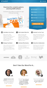
A high converting landing page for a brand is like a killer resume for a job seeker. The potential taker gives it a glance for a few seconds and decides whether to move ahead with the positive next step or dump it and move away! In both cases, the potential taker has the need and that is the very reason they bothered to take a look at what you can offer. But how impressive you make yourself look depends upon you and that is why you play a significant role in determining if you are taken by the target audience.
So how do you make a high converting landing page? Here are some tips on what makes a landing page really effective and what compels visitors to convert.
Make the Design Clean, Clear & Composed
One of the first things that grab the attention of a visitor is the overall design of the landing page. The design should be nice, tidy, minimalistic and organized, thus welcoming the visitor to go through the page and spend more time on it. If the design is busy and confusing, visitor would tend to immediately leave the page. The design of a high converting landing page ensures that each element gets its due attention.
Use Engaging Visuals
Compelling images and videos quickly grab attention of landing page visitors. These are tools to engage the visitors and make them love your landing page. And chances are very high, when they love your landing page, they would take the action you want them to take.
Make a Powerful Headline
Headline is another element of a landing page that grabs the attention first. Make a powerful statement with the headline so that visitors are compelled to read the rest of the page and take the desired action. The headline should promise a great value that is relevant to the visitors. The copy, position, size, font, color of the headline should not only make it stand out but also make it look convincing.
Mention Major Benefits
A high converting landing page clearly highlights the major benefits of your product / service. It should also talk about the pain points of your target audience so that they can connect with your brand. Then you should briefly explain how your product/service is great to address those pain points. Landing page should make it easy to understand what problems you are solving.
Make a Great Offer
There must be something lucrative in the landing page that would make your visitor want to take the action you want. So value has to be there. It could be a free e-book or report, or some free demo/trial, or some discount if they purchase your product/service or may be some lucky draw! It could be anything that they find valuable enough to be prompted to hit your Call-to-Action.
Add Trust Signals / Social Proofs
Trust plays an important role in making a decision to go ahead and get associated with a brand. It’s important to instill a sense of trust in your target audience so that they feel safe and assured while taking the action you want them to take. So put something in the landing page that work as trust signal or social proof. Testimonials from existing customers work best as social proof. You may also use names/logos of your current customers. Press mentions also do well as trust signals. Even vital stats like number of customers, years of operations, number of cities/states/countries to where your customers belong etc will do.
Have Obvious Call-to-Action
Call-to-Action (CTA) is that very thing that you want the visitor to do after going through the landing page. So make the CTA so obvious that they are compelled to go ahead with it. A high converting landing page has a very clear Call-to-Action with no scope for confusion. The Call-to-Action can vary depending upon your objective. It could be anything that persuades the visitor while fulfilling your objective. For example, you may want to sell something. So your CTA button may read ‘Buy Now’. If your objective is to build an email list by offering a free report, you CTA button may say “Send My Copy of Free Report”.
To learn more about how to create great CTAs, you may like to go through this post: Call-to-Action: Read Now To Make Your CTAs Effective
Keep the Form Short & Simple
Visitors have limited patience and time that they can spare for you. So whatever form you want them to fill up, should be short and easy to fill up. If they find the form long, time consuming and not-so-simple, they may leave right away without filling up the form.

Focus on a Single Goal
While it could be tempting to want to achieve multiple goals from a single landing page, in reality that hardly works. A landing page should have a single objective. For achieving multiple objectives you may want to go for multiple landing pages. Having single goal makes it easy for the visitor to clearly understand what the landing page is for and they can move forward smoothly without being confused. So your chance of converting that visitor increases when you focus on a single goal.
Keep the Flow in the Right Order
Think about human psychology while structuring the flow of content/elements of the landing page. The headline should be at the top followed by the pain points, benefits and offer, and then social proof followed by the Call-to-Action. The flow of the landing page should match the psychological expectation of the visitor so that they feel connected and tend to hit the CTA.
Keep the Landing Page Copy Consistent with the Corresponding Ads
Normally landing pages are associated with some advertisements. Visitors hit on the ads and directed towards the landing page with the expectation of getting more details of what the ads said. So it is important to feed the visitors with more information consistent with the ads. If the landing page copy talks about something else which is different than the ads, the visitors may feel duped and leave the page immediately.
Prove you are Legit with Multiple Methods of Contact
Visitors feel secured when they find multiple ways of catching hold of you. So include as many contact methods as possible. Apart from the contact form, include your email address, phone number, Skype name, social media handles and a physical office address. This would build more trust in the mind of your visitors.
Make Your Landing Page Device Responsive
As you might already know, more than 50% of the web visitors use smart phones and tabs to visit websites. So to be able to cater to them, your landing page should be device responsive, which means the page should optimize the display based on the device it is used to open. That way your visitors would get best possible views of the landing page on their respective devices.
Test & Test & Test!
Testing your landing page is a continuous process. You have to try different stuff and ways to find out what works best. So never stop testing if you want to continue to get great conversion ration from your landing page.
The above tips should work well if you are able to implement them properly. In case you need help designing a high converting landing page, please feel free to contact Digital Medio team. The experts here will be glad to take care of your landing page.


 Call-To-Action: Read Now To Make Your CTAs Effective
 What Style Of Animated Video Should You Choose For Your Business?
 How To Choose The Right Animated Explainer Video Production Company